用了一段时间的 material-ui,都很少自己动手写原生的样式了。但 html, css, js 始终是前端的三大基础,这周突然想到 CSS 水平居中方案,因为用多了 flex 和 margin: auto等这类方案解决,在回顾还有还有几种方案可以解决,于是打算温故知新,重新打下代码,写下该文作为笔记。
html 代码
1
2
3
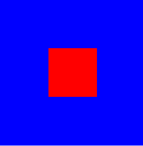
| <div class="parent">
<div class="child"></div>
</div>
|
css 代码
1
2
3
4
5
6
7
8
9
10
| .parent {
width: 300px;
height: 300px;
background-color: blue;
}
.child {
width: 100px;
height: 100px;
background-color: red;
}
|
下面代码基于上述代码增加,不会再重复写。要实现的效果是让子元素在父元素中水平垂直居中
一、flex 布局
1
2
3
4
5
| .parent {
display: flex;
justify-content: center;
align-items: center;
}
|
这是最经典的用法了,不过,也可以有另一种写法实现:
1
2
3
4
5
6
7
| .parent {
display: flex;
}
.child {
align-self: center;
margin: auto;
}
|
二、absolute + 负 margin
该方法适用于知道固定宽高的情况。
1
2
3
4
5
6
7
8
9
10
| .parent {
position: relative;
}
.child {
position: absolute;
top: 50%;
left: 50%;
margin-top: -50px;
margin-left: -50px;
}
|
1
2
3
4
5
6
7
8
9
| .parent {
position: relative;
}
.child {
position: absolute;
top: 50%;
left: 50%;
transform: translate(-50%, -50%);
}
|
四、absolute + margin auto
1
2
3
4
5
6
7
8
9
10
11
| .parent {
position: relative;
}
.child {
position: absolute;
top: 0;
left: 0;
right: 0;
bottom: 0;
margin: auto;
}
|
五、absolute + calc
该方法适用于知道固定宽高的情况。
1
2
3
4
5
6
7
8
| .parent {
position: relative;
}
.child {
position: absolute;
top: calc(50% - 50px);
left: calc(50% - 50px);
}
|
六、text-align + vertical-align
1
2
3
4
5
6
7
8
9
| .parent {
text-align: center;
line-height: 300px;
}
.child {
display: inline-block;
vertical-align: middle;
line-height: initial;
}
|
七、table-cell
1
2
3
4
5
6
7
8
| .parent {
display: table-cell;
text-align: center;
vertical-align: middle;
}
.child {
display: inline-block;
}
|
八、Grid
1
2
3
4
5
6
7
| .parent {
display: grid;
}
.child {
align-self: center;
justify-self: center;
}
|
九、writing-mode
1
2
3
4
5
6
7
8
9
| .parent {
writing-mode: vertical-lr;
text-align: center;
}
.child {
writing-mode: horizontal-tb;
display: inline-block;
margin: 0 calc(50% - 50px);
}
|